CTA Bar
-
Usage
-
Style
-
Content
-
Accessibility
-
Usage
Component which grants the user access to a choice of 1-4 columns where they can customise the bar with an icon, link, and text
Create the CTA Bar Component
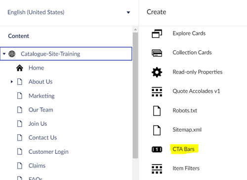
- From the site, click to create a CTA Bar
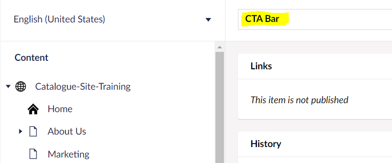
- Provide a name, Save and publish
Add items to CTA Bar
- Click on the CTA Bar Component created
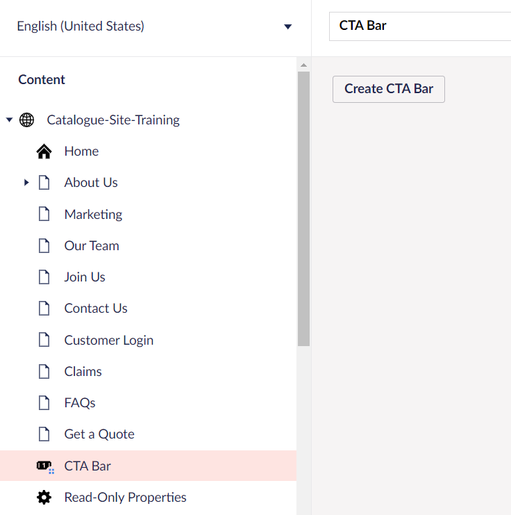
- Click Create CTA Bar button and give a name for CTA Bar item as Call
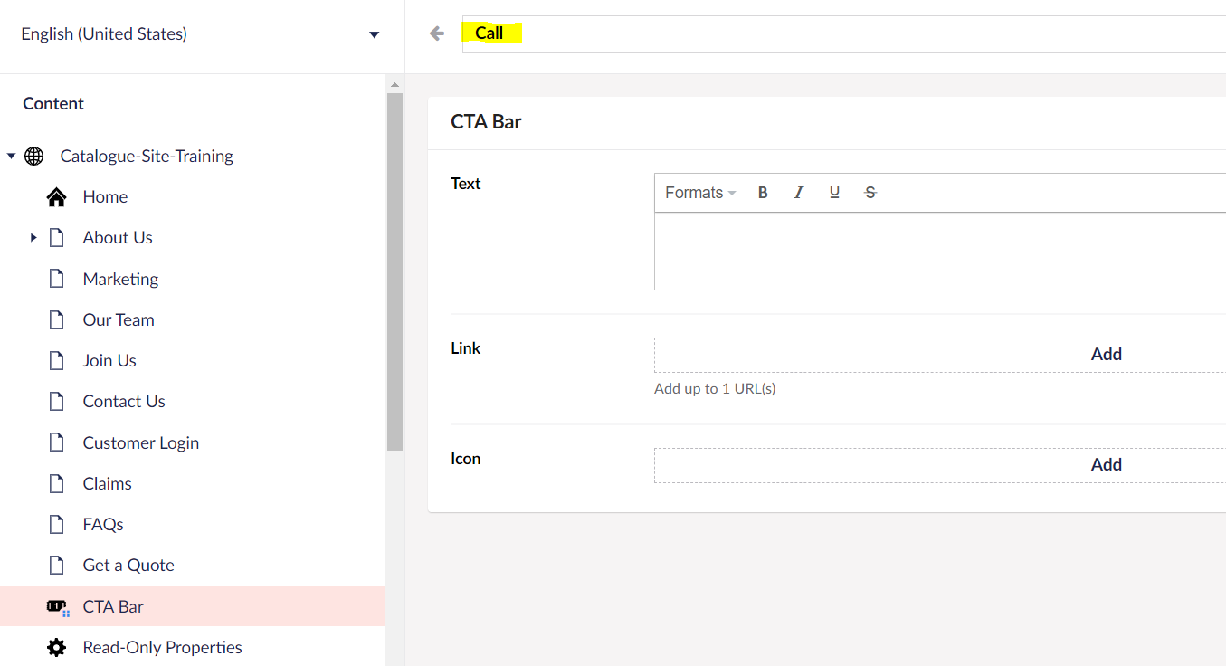
- Add Text
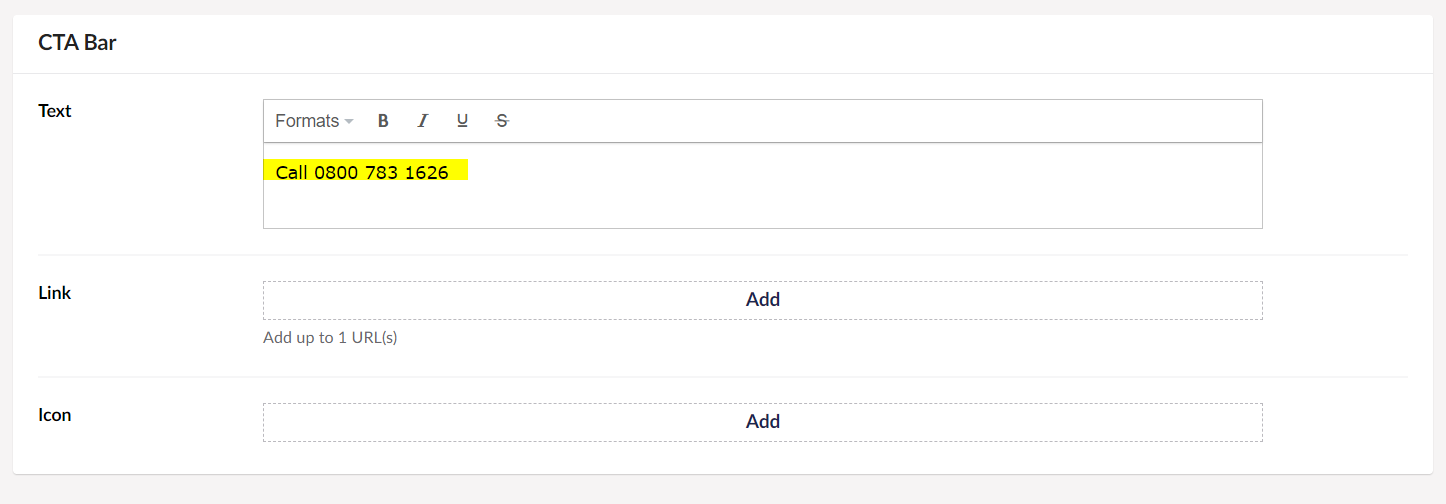
- Add Link
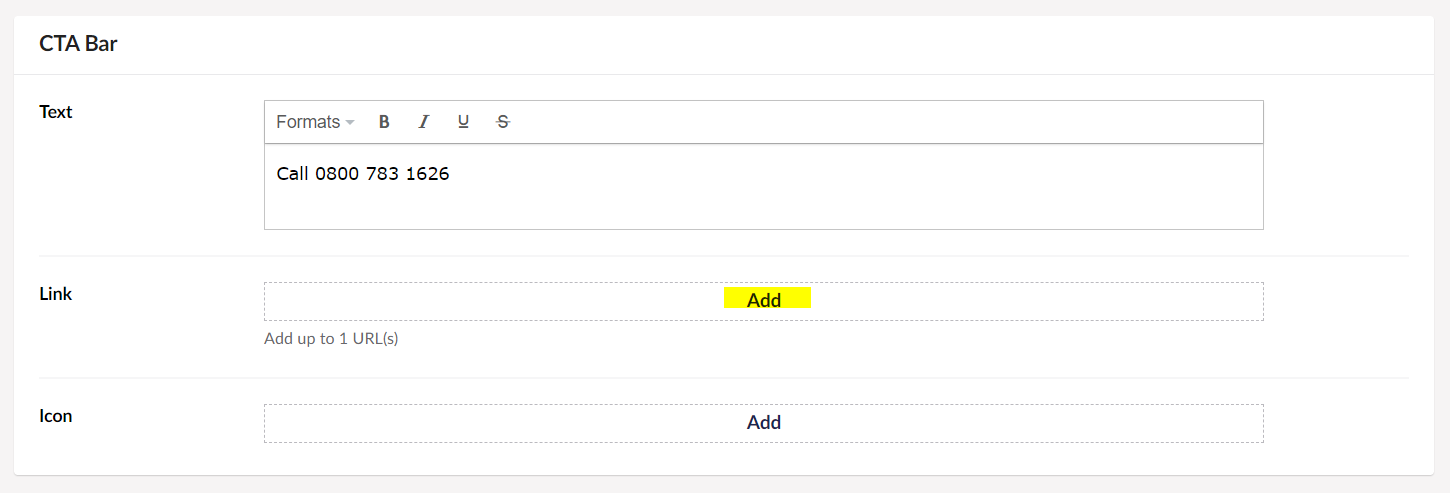
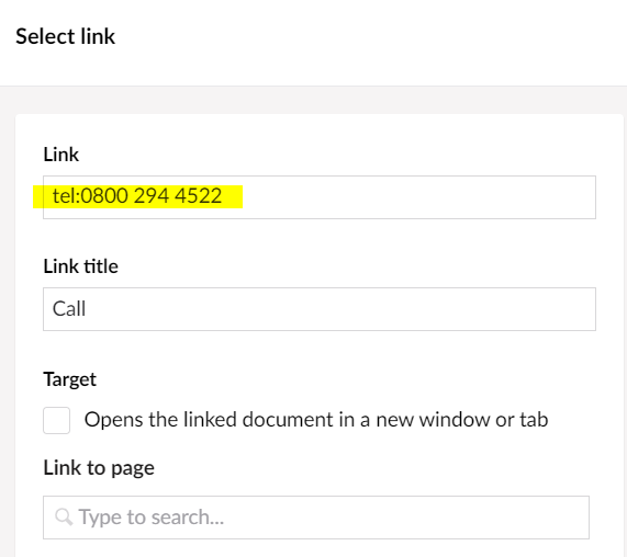
- For link, add the phone number
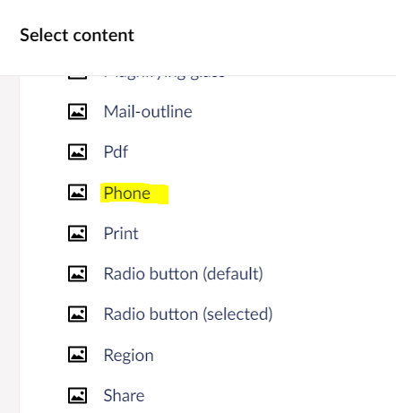
- To pick an Icon, click add link

- Select an Icon
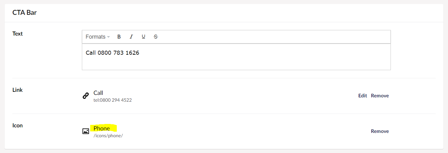
Repeat the same for other CTA Bar Items
- To create another item, click Create CTA Bar
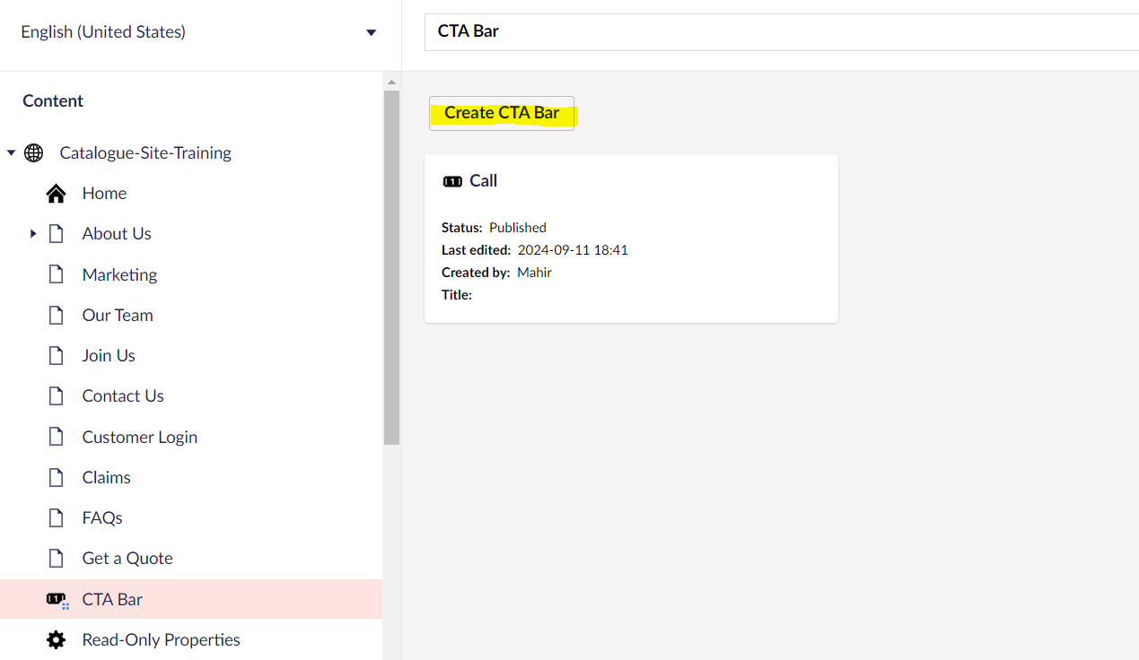
- Follow previous steps to create an item for Email Us

- Follow previous steps to create an item for Contact Us
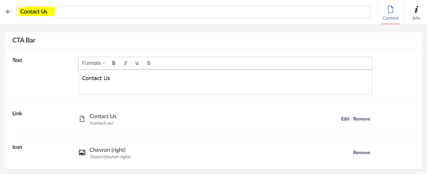
- 3 CTA Bar items created

Adding CTA Bar Component to a Page
- Create a page in Content name it as CTA Page
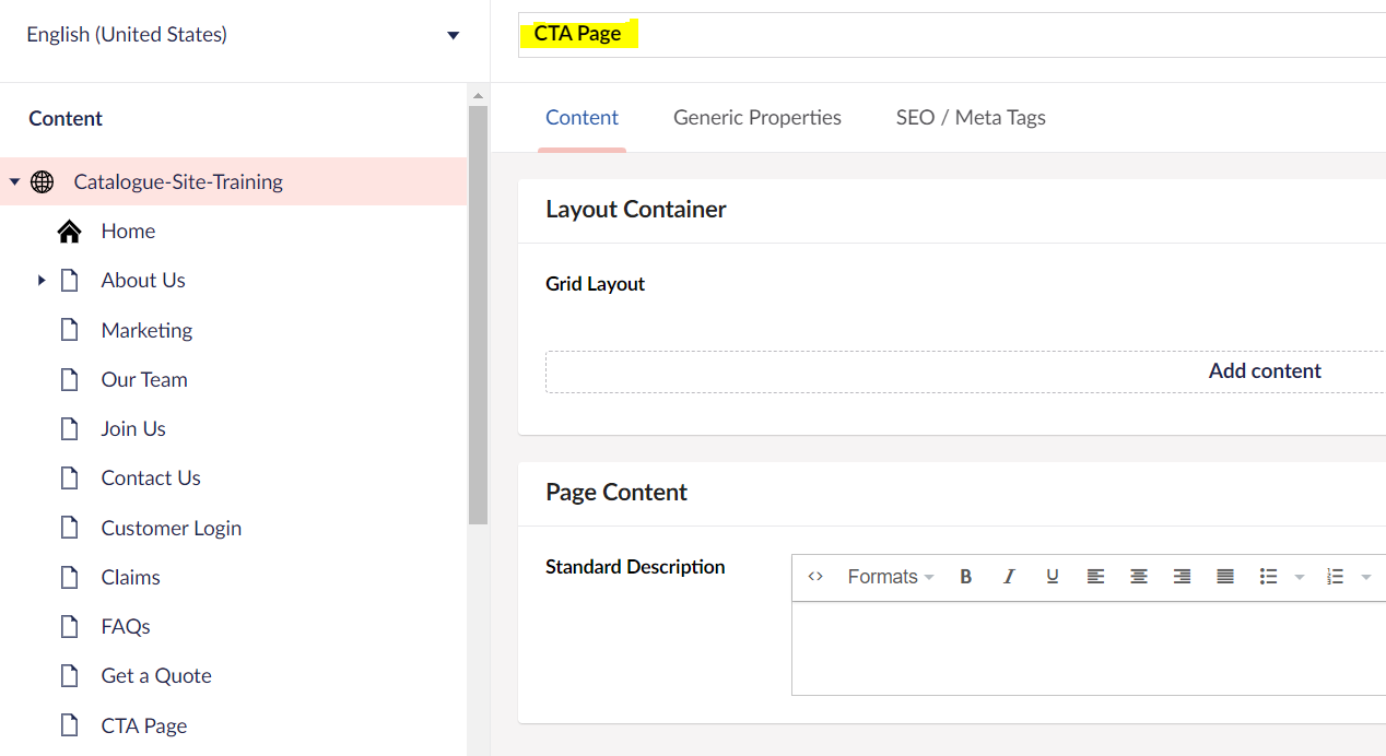
- Add a Section Block to the page

- Add a 3 Column Layout to the Section Block
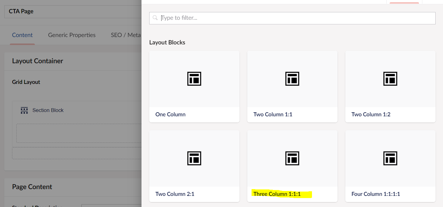
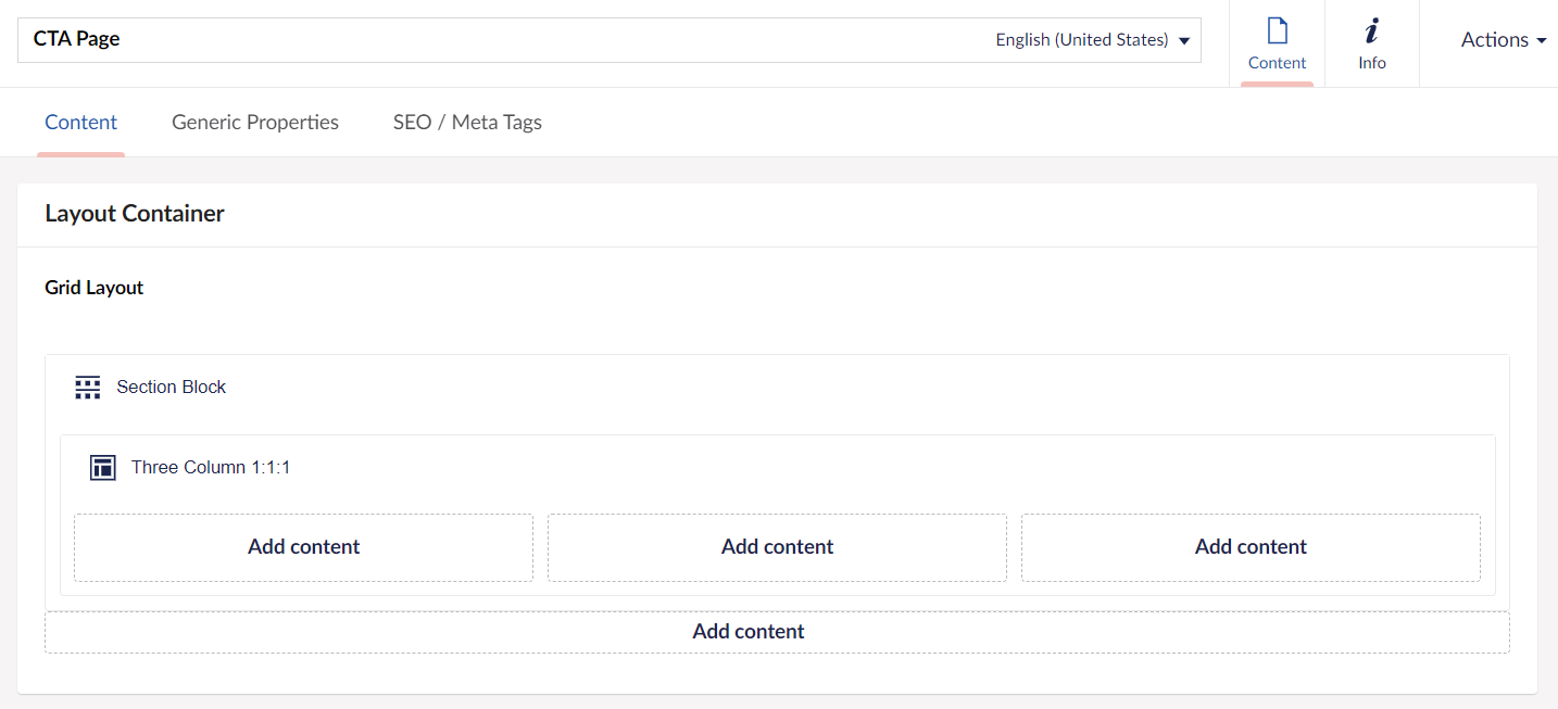
Adding CTA Bar Item to a Column
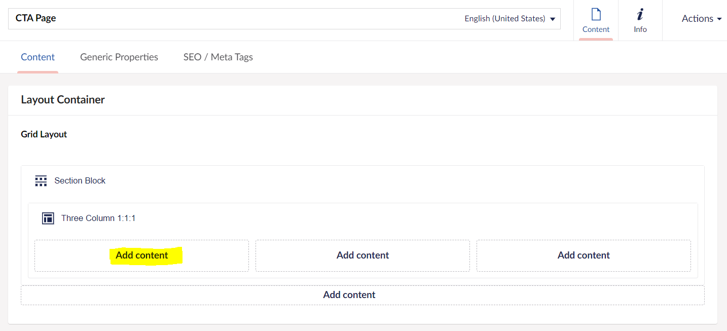
- Click Add content in the Column
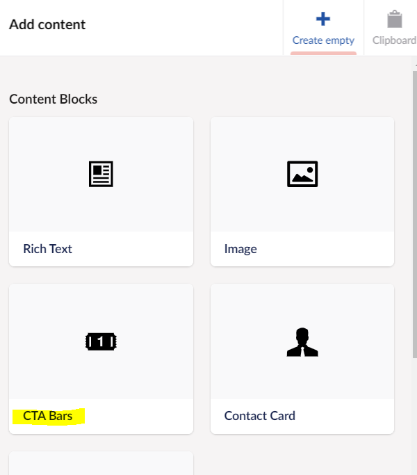
- Select CTA Bars
- Click Add for CTA Picker
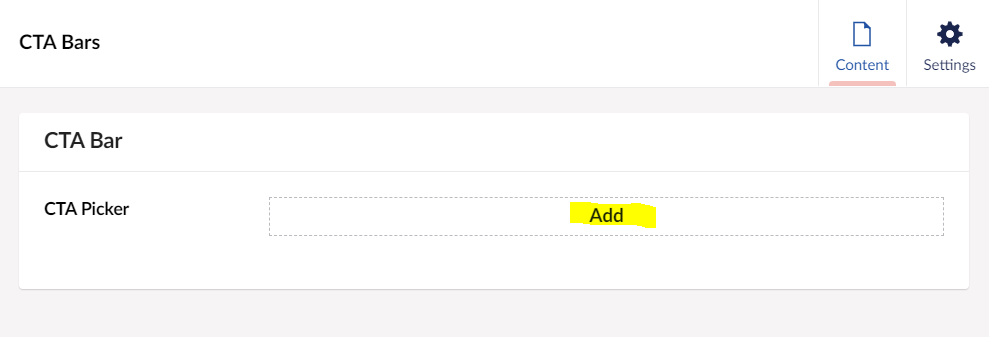
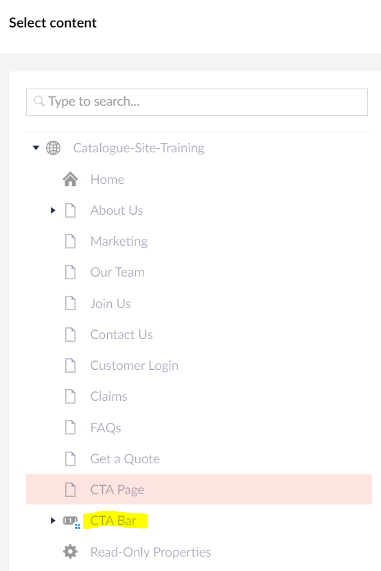
- Select CTA Bar
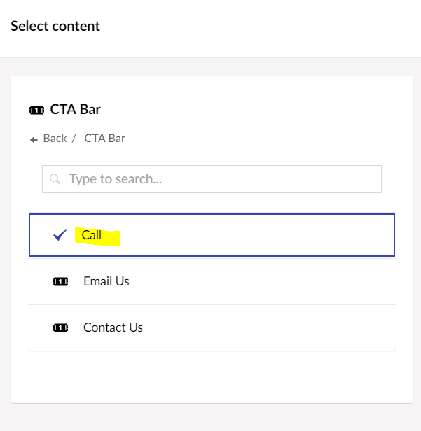
- Click Call and Submit
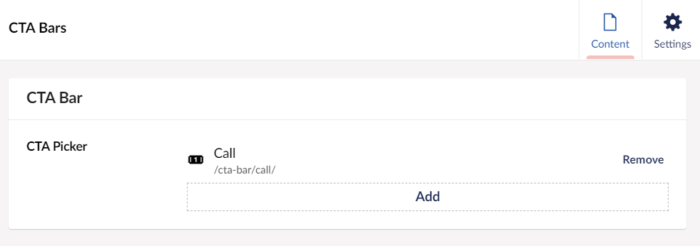
- Click Create, Call CTA Bar Item added to the first column
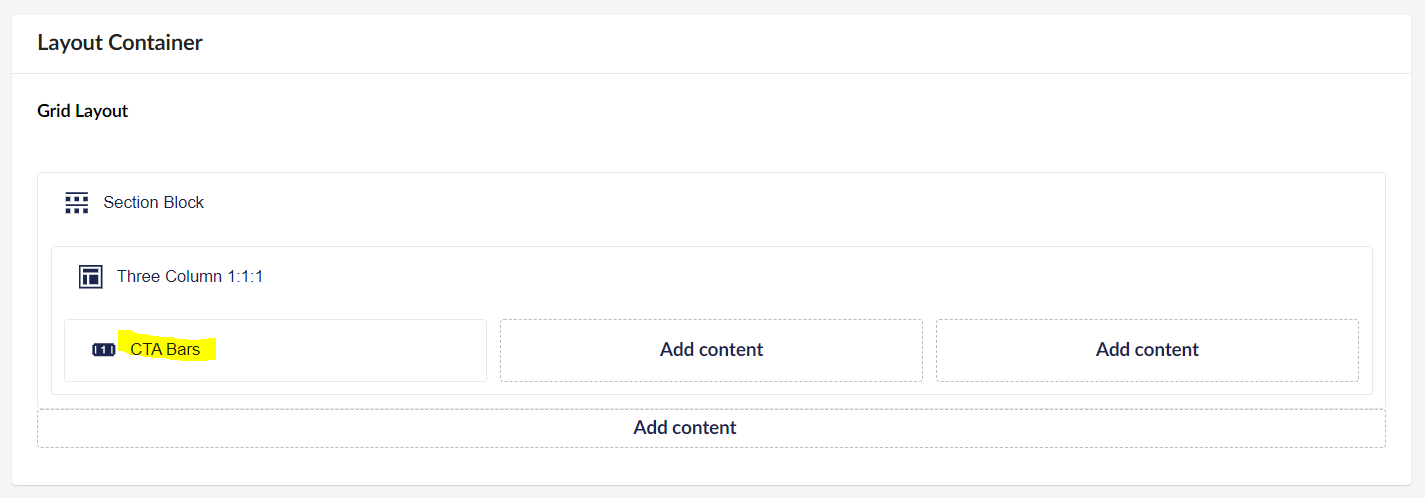
- Repeat the same steps to add Email Us and Contact Us to column 2 and 3
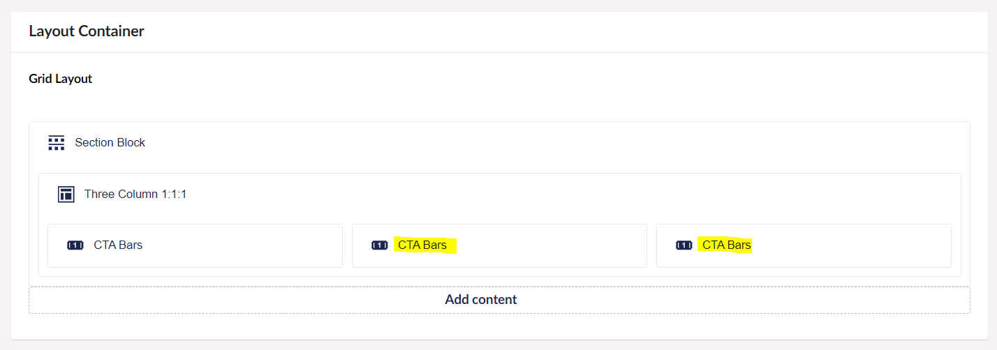
- Hover over the CTA Bar in the column and click the Cog icons to set Icon and Text color

- Click the Add link

- Pick a Color
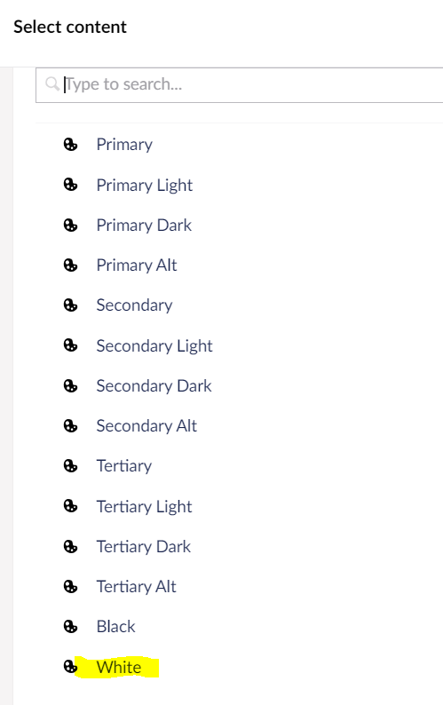
- Color selected and add the colors to other CTA Bar items

Setting Column background color
- Click Cog icon in the Section Block for Settings

- Select the Background Color by clicking the Add link

- Select Primary Color


- Preview it in Front end after clicking Save and Publish button
Open in new window
-
Style
-
Content
-
Accessibility